Contrast.
Light and darkness.
Warm and cool colors.
Large and small shapes.
Smooth and textured surfaces.
Stillness and movement.
Artists use contrast to create visual interest, guide attention, and communicate emotion. Without contrast, a painting can feel flat and predictable. With contrast, it becomes dynamic, engaging, and unforgettable.
Leonid Afremov understood this principle exceptionally well. Although he is best known for his vibrant palette knife paintings, contrast played a central role in many of his most powerful compositions.
https://afremov.com/rain-princess-with- ... and-w.html
---
What Is Contrast in Art?
Contrast occurs when artists place opposing elements together.
These differences help certain parts of a painting stand out and become more noticeable.
Artists create contrast through:
* color,
* value (light and dark),
* texture,
* shape,
* size,
* subject matter,
* and composition.
The greater the difference between two elements, the stronger the contrast becomes.
Contrast helps answer an important question:
**"Where should the viewer look?"**
It creates emphasis, drama, and visual energy.
---
Why Contrast Matters
Imagine a painting created entirely with similar colors, textures, and values.
Nothing stands out.
Nothing commands attention.
The viewer's eye may wander without direction.
Contrast creates excitement.
It helps establish focal points.
It allows artists to communicate mood and emotion more effectively.
Many of the most powerful visual experiences rely on contrast.
After all, we appreciate light because darkness exists.
We notice warmth because we understand cold.
Opposites help us understand one another.
The same principle applies to art.
---
Color Contrast
One of the most recognizable forms of contrast is color.
Artists often place:
* warm colors against cool colors,
* bright colors against muted colors,
* or complementary colors side by side.
Leonid Afremov frequently used this technique.
His glowing yellows and oranges often appear against deep blues and purples.
The result is dramatic, energetic, and emotionally engaging.
The colors seem to illuminate one another.
---
Light and Darkness
Value contrast—the relationship between light and dark—is another powerful artistic tool.
A bright object surrounded by darkness immediately attracts attention.
Many of Afremov's famous street scenes rely on this principle.
Streetlamps glow because they are surrounded by night.
Reflections shine because they emerge from darker surroundings.
Without darkness, the light would lose much of its emotional impact.
---
Texture Contrast
Contrast can also be created through texture.
A highly textured surface placed next to a smoother area naturally attracts attention.
Because Leonid worked primarily with a palette knife, texture became one of his signature artistic elements.
The raised paint catches light differently, creating additional layers of visual contrast throughout the composition.
---
Emotional Contrast
Some of the most powerful contrasts are emotional rather than visual.
Leonid often explored contrasts such as:
* rain and warmth,
* solitude and companionship,
* darkness and hope,
* nostalgia and optimism.
These emotional opposites create depth and allow viewers to connect with the artwork on a personal level.
A rainy street feels comforting because of the warm light.
A lonely figure feels hopeful because of the glowing path ahead.
Contrast helps tell the story.
---
Leonid Afremov's Black and White Collection
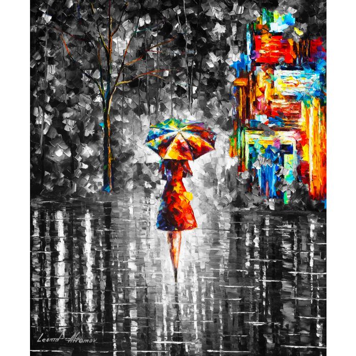
One of the most striking examples of contrast in Leonid Afremov's work can be found in his famous black and white collection.
Unlike many of his colorful cityscapes, these paintings feature predominantly black, white, and grayscale backgrounds.
Then something extraordinary happens.
A single figure appears.
A woman walking beneath an umbrella.
A couple embracing.
A dancer.
A musician.
And while the world around them remains monochromatic, the figure bursts with vibrant color.
Reds.
Yellows.
Blues.
Oranges.
The contrast is immediate and powerful.
The colorful figure becomes impossible to ignore.
---
Why This Series Resonates With Collectors
Collectors are often drawn to this series because the contrast feels symbolic.
The colorful figure seems to represent:
* individuality,
* emotion,
* hope,
* creativity,
* love,
* or the human spirit itself.
Against a black-and-white world, the vibrant colors become even more meaningful.
The paintings remind us that beauty often stands out most clearly when surrounded by simplicity.
Many viewers see themselves in these colorful figures.
Others see a loved one.
Still others see a reminder to remain vibrant and optimistic regardless of the circumstances around them.
This is contrast working not only visually, but emotionally.
---
Contrast Creates Meaning
Leonid Afremov understood that contrast does more than create visual drama.
It creates meaning.
A colorful umbrella is more noticeable against a gray street.
A warm light feels brighter against a dark night.
A joyful moment feels more powerful after sadness.
Contrast helps artists tell stories without words.
It allows viewers to experience emotion through visual relationships.
---
Contrast in Your Home
Contrast is also one reason artwork can have such a strong impact within interior design.
A colorful painting can become a focal point in a neutral room.
A black-and-white composition can add sophistication to a vibrant space.
Collectors often use contrast intentionally when selecting artwork because it creates energy and visual interest.
The right contrast can transform an entire room.
---
Contrast is one of the most powerful principles in art.
It creates focus.
It creates emotion.
It creates visual excitement.
Most importantly, it helps artists communicate meaning.
Leonid Afremov used contrast throughout his career, from the glowing lights of his rainy streets to the bold emotional symbolism of his black-and-white collection featuring vibrant colorful figures.
His work reminds us that opposites are not meant to compete.
They are meant to enhance one another.
Light needs darkness.
Color needs neutrality.
And sometimes, the most beautiful stories emerge where contrasts meet.
If you have questions about Leonid Afremov's paintings, artistic techniques, or the Afremov Art Studio today, feel free to click "Post Reply" below and join the conversation. We'd love to hear which Afremov painting creates the strongest contrast for you.